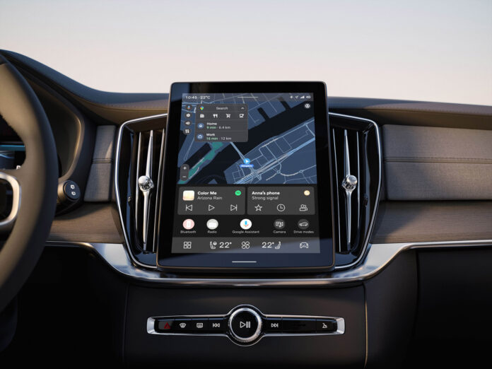
At Volvo Cars, we aim to make complexity simple. We want to create a great experience that helps you go about your daily life with your car in a safe, focused and enjoyable way. This is what guided us when we created the new infotainment system in our all-electric EX90 and EX30 models.
Now we’re also bringing this philosophy to our celebrated Volvo XC90 SUV. But the new user experience won’t be limited to just one model. We will also deliver our latest user experience to millions of Volvo drivers around the world with a simple over-the-air software update. If you currently drive a Volvo car with Google built-in*, you’ll also get an upgraded layout – free of charge.
During 2025, around 2.5 million customers around the globe will receive an upgrade on their Volvo cars built as early as 2020**. We plan to gradually roll out this upgrade during the year and believe this is one of the most comprehensive infotainment updates by any car maker to date. This roll-out is in line with our strategy to make our cars better over time with regular over-the-air software updates.
“Our new-generation user experience will deliver a significant improvement in customer experience and is an important step in our journey to delivery human-centric technology solutions to our customers,” says Erik Severinson, Chief Product and Strategy Officer at Volvo Cars. “We’ll continuously and seamlessly adapt the user experience to match the needs of our customers through new and enhanced features that are delivered through over-the-air updates, to improve your car – and your experience – over time.”
To further enhance the experience inside the new XC90, we’ve installed a larger, 11.2-inch, free-standing central screen. We’ve also increased the pixel density by 21 per cent, resulting in an even crisper display.
But the content on the screen represents the biggest change. We now present the most common apps and controls, such as maps, media and phone on the home screen – the same setup as our latest electric cars. That means it takes fewer taps on the screen to get to the features you most often use. For example, if you’re following navigation directions and want to change the music, you no longer have to leave Google Maps to access the media feature. It’s there for you already.
Then there is the contextual bar, which changes what you see according to the situation and displays your most recently used apps. And if you’re driving at low speeds, the icon for outside cameras appears so you can get help manoeuvring in tight spaces.
If you’re a plug-in hybrid driver, we’re making it easier for you to get the most out of your electric powertrain. Via “Drive Modes” on the home screen you can easily access “Pure” mode alongside other options. If you’ve just arrived in a town centre and want to drive on electric power only, it’s now just a tap away.
Our new-generation user experience can be adapted and scaled to fit different screen shapes and sizes. That way, we can bring the latest Volvo Cars infotainment experience to you, no matter if you drive a new XC90, an EX90, or a three-year-old XC40, and make it easier for you to focus on what truly matters: the road ahead.
* Or its equivalent in China and South Korea.
** Including C40, XC40, EX40, EC40, S60, V60, V60 Cross Country, XC60, S90, V90, V90 Cross Country and XC90 with Android operating system.
Google, Google Play and Google Maps are trademarks of Google LLC.


